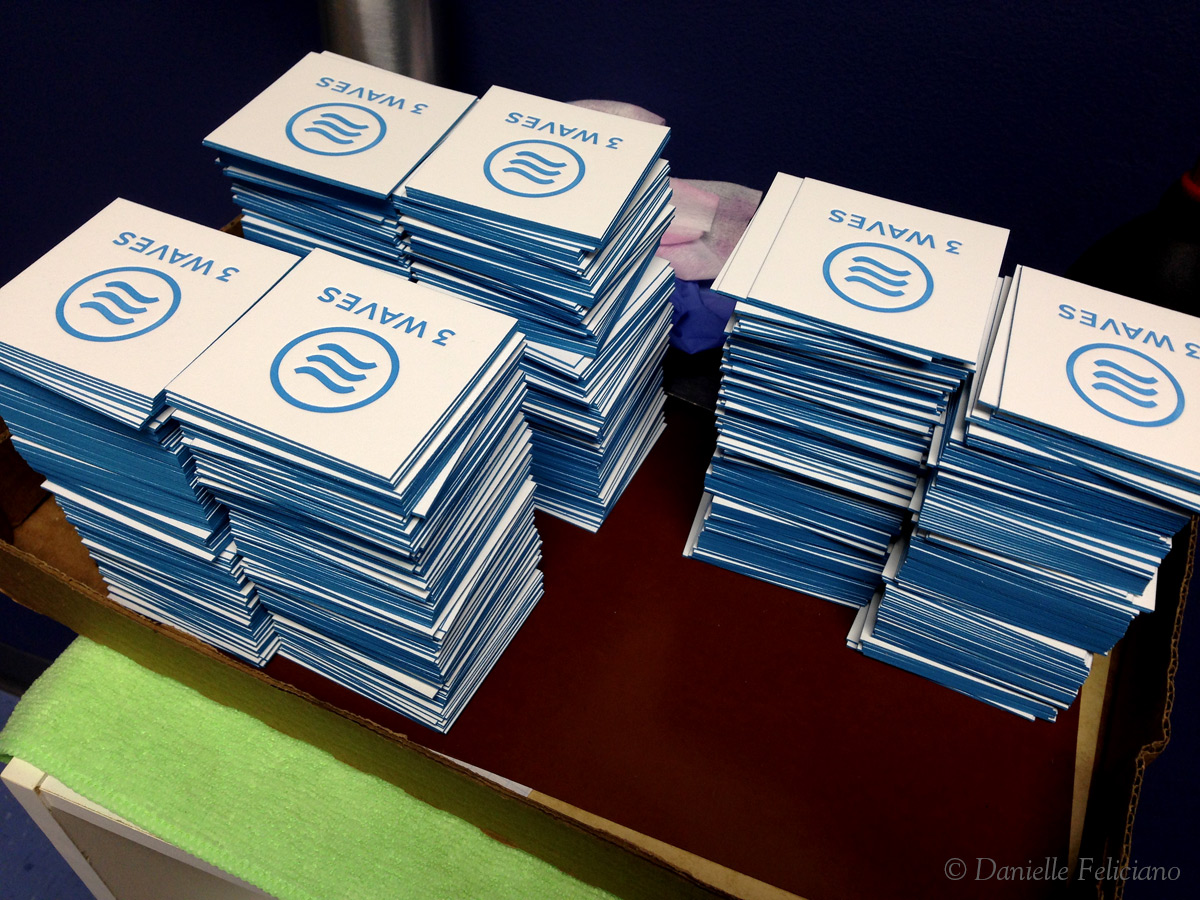
For this business card job for 3 Waves Media in Virginia Beach, I decided to do something a little different. In order to end up with the least amount of waste – I decided to trim and edge paint all of the cards first. I went to River City Graphics to have them trimmed down as their cutter is far superior to my little crooked manual one. Once they were trimmed I went right into edge painting. By edge painting first, I don’t ruin perfectly good prints (the over-sprayed cards can be used for line up and ink adjustment), I am able to better match the edge painting to the ink (since I think adjusting the press ink is easier), and personally it just seems to speed up the job. The disadvantage is that I had to feed one by one – which on my small 7×11″ press is probably better anyway.


I did learn a few things by doing the job in this seemingly reverse order:
1. The edge painting was NOT damaged by feeding into my pins. I use compressible pins made from foam tape, but I didn’t have any issues with the edge painting rubbing off, chipping, or transferring
2. These acrylic paints dry very quickly – by the time you finish all four sides, they are ready to be gently separated. They seem to set well with no rub off or transferring.
3. More flow aid- I found when I was doing so many stacks (I kept my stacks small so I could focus on getting nice even coverage) that the acrylic when too thick would clog the nozzle over time. For a short job I could leave the paint thicker but for a longer working time I needed more flow aid than I previously thought. Think milk, not yogurt for consistency.
4. 220lb White Savoy is top notch for edge painting. I think it does better than the Lettra but the difference might be negligible or affected by other factors I’m not noticing.


Whenever I’m printing I carefully work to try and get one perfect print – I then keep that print and my swatch or pantone guide on the delivery board so I can cross check each print that I pull from the press. It’s slower going, and I run the press as slowly as the motor will go, but I’m better able to keep track on the prints and notice if things change (like ink gets too thin or there is a blank spot). With this job I printed the logo first, which took more ink. I had to darken the ink so that the lighter coverage of ink on the text would be a good color match for the logo on the front. I think this issue is one of the secret skills of letterpress – you can use the exact same ink and get a huge range of tints based on how much is on press and how much is laying on your plates. I find I need to adjust the color in those cases where just ‘adding more ink’ isn’t an option ( when it will cause the plate to fill in or be over inked).


Savoy is totally my favorite paper right now. It doesn’t fuzz or flake like Lettra can, so it’s got a nice, crisp edge for painting.
Hi! Can you tell me s bit more about what you found better with the white savoy compared to lettra? I’ve been using only lettra paper and am planning to do edge pairing on the 220. (I read your other post and purchased each item you listed! I’m studying your method!!)
Much Ppreciated. Your blog posts are super helpful!
It just seems to cut better. The difference is somewhat subtle but the edge tends to be a little bit cleaner because the paper itself is firmer than lettra. For this same reason I think it prints slightly better too.
Hello, great tutorial! I have a question regarding color matching your edge painting. How do you go about doing that? Do you eyeball it, or do you use a color recipe like the pantone book?
Thank you!
For color matching edges I take the Pantone book with me and just buy the closest color I can find at the store. The cheap .79 cent acrylics at the craft store work great when thinned with airbrush medium as they are already a thinner consistency. If I need to adjust the color further I would do it by eye but I prefer to buy the closest color and not adjust because that way I won’t run into trouble if I didn’t mix up enough of the custom color (it sucks when you mixed a custom color by eye, run out halfway through a job, and then have to try and perfectly match again).
That makes complete sense; thanks for the insight!