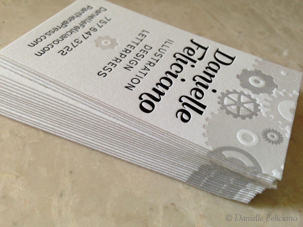
For this post I’m hoping to give some insight into my full printing process from beginning to end – digital to edge painting. These are some simple business cards designed for this very experiment.
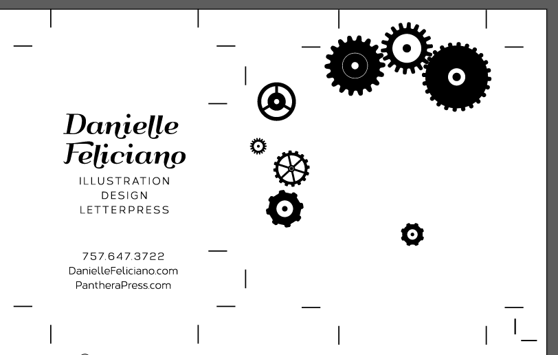
1. I do all my designing for plates in Adobe Illustrator. On occasion I will do an inking by hand, scan it, and turn it into a bitmap, but I don’t do that often anymore because I have little trouble inking and drawing in Illustrator with the help of a tablet. Once I’ve created my design, I outline all strokes and text and use the Effects>Crop Marks feature to add crop marks. I then expand the crop marks and thicken them up to 1pt and shorten them so they take less space. The thicker crop marks help with my line up, but be careful when you line up to trim that you hit them down the center (not ahead of or behind them as this will throw off your trimming by a tiny bit which might show in certain designs).

2. Once that is done and I have each color on its own layer, I set everything to black, separate and group the plates and move them to a new file to send off to Boxcar. I fit them nice and tight and just carefully cut around them with scissors.
3. Once the plates arrive, I cut down the paper, mix the ink, and prep the press. In this case I had some scrap paper which was large enough to do a work and turn. Particularly for something small, it’s better start with a larger sheet and cut down after the job is done as it can be dangerous or difficult to feed a small sheet. When I can, I set up my plates so I only have to trim two edges, but not always. I use a ruler and a ball point pen to draw a line from crop mark to crop mark (by resting the ruler edge against the raised crop mark) and then I draw up lines on the paper stock where I want things to line up

4. I place the plate ink/printing side to paper and looking through the photopolymer line up the lines. Using a loop of tape I tape the plate in place in its lined up position and remove the backing. The sheet is placed in the pins and then by hand I turn the flywheel and deposit the plate onto the press. Usually, there are no adjustments needed and I can print the first color.

5. Lining up the second color goes nearly the same way, except When I line up the second color I use the depressions made by the first crop marks to seat the second plate. If I do not have crop marks or there wasnt room for them on the paper, I will use the line method from the earlier step and line up key elements that way. The crop mark method saves me untold amounts of time and so I gladly pay the extra money for a larger plate and large paper. You can feel them seating into the first set of crop marks pretty easily if there is any depth at all. If I’m going for light impression I just make sure to take one print with a very deep impression to use for line up.

For this plate, I saved money by just including the top crop marks and not wasting plate space by added a large blank area and bottom crop marks.


Here the backing from the plate is removed and the plate is deposited on the base

Once you deposit the plate on the base slowly back the press off and pull the sheet out so the rollers (if they’re already on press) don’t grab and mangle the paper. Remove any tape and let the plate ink up.
6. The third and final color is printed in the same way. I find that crop marks work better than registration crosshairs in a circle (a technique I’ve used before to try an save space and money). You just get a better visual of misalignment – particularly when it’s coming from incorrect rotation of the plate, not a left to right or top to bottom misalignment which is more easily fixed.


7. Once the printing is done, it’s time to trim it down. I try, whenever I can to use the edges the were fed into the press to align the cuts (so you’re cutting opposite sides of those which fed in). This assures MUCH better trimming, especially if your first cuts where not absolutely perfect when you cut down the sheets to begin with. Below, I did not follow my own advice because the work and turn required a different plan, but generally use the same corner to align the cuts as you did when you printed. You always want to feed your paper for the second and third color and cut the paper using the same two edges as a guide.

8. Once they were fully cut down, they are ready for edge painting. I take great care in the cutting, using a block (you can see it above in the corner) to ensure the stacks are square in the cutter and so when I’m done everything is lined up and even.

9. This is most important with edge painting – you can see below how I stack them up with some of my pre-cut masonite blocks. Once they are flushed and stacked, they are clamped very tightly. I would probably recommend three clamps not two as I have used, but mine worked fine.


10. I decided to try spraying the block with clear medium first, so that it might seal the edges and prevent any bleeding (a house painters trick when using tape to make stripes or designs, sealing the edges keeps paint from seeping under the tape!). I mixed pure airbrush medium with some clear coat.
Then once that was done, I prepped the silver using equal parts silver and airbrush medium with a couple of drops of flow aid. Golden’s flow aid is expensive so I tried a cheap acrylic extender this time which worked fine for this job.


I‘ve been mixing in little medicine cups which were very cheap and last for a few uses before tossing.
11. The pigment is gently mixed and added to the airbrush when it’s as thin as milk. I add a few drops of water if needed to thin, but this extender was fine for thinning this time.

12. The edges are sprayed in light coats from about 8-12″ away. I turn the stack on the turntable and coat each side with care. Once that’s done I let it dry a bit (I go clean the airbrush and the press area). Then I unclamp, peel them apart and discard any that were mis-printed or mis-sprayed. I find that because this design has a bleed on one edge (you can see it looks like a dark stripe along the side shown above) – the gap caused by the impression let a teeny bit of silver in on a few of them, only a few were tossed, there was no bleeding to speak of. I find bleeding is usually a result of the paint being too watery (main reason) or the stack not being tight enough (secondary reason), so keep that in mind.

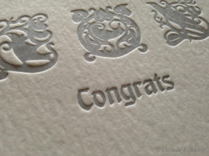
13. That’s that! A job from beginning to end at Panthera Press. Printed on White Crane Lettra at 300gsm. I used silver ink thinned with transparent white and overprinted the grey areas. I should have gone with black, not a metallic ink because the silver pigment particles seem to separate a bit when thinned to much. Generally, I found metallics do NOT play well with any other pigments or mixing in general. It might be the heavier, more opaque particles. I’m not sure, but I’ve never had luck thinning or mixing it without getting some blotchiness. It isn’t too noticeable here but in some it was more obvious and they were culled.


Beautiful work and I loved the tutorial Youtube videos..
Hi,
I was wondering what brand or clear coat you used to seal the paper edges?
Mirely
In the past I tried coating with thinned down matte medium, but I found when using acrylic paint there is no need and it’s just an extra step. So, essentially I do not coat the edges.
Thanks so much for responding!
Have you ever tried using letterpress ink for your airbrush machine?
Working on a project and want to match my colors as close as possible.
I would not recommend that. Letterpress ink is incredibly thick so by the time you get it thin enough it probably won’t even look like the original color. Plus the the amount of mineral spirits you’d need to thin the color might make it bleed into the paper. You’re best off learning to mix a matching color in my opinion.
I was wondering if I should even try, but I definitely won’t now!
Thank you so much, you were super helpful.