I decided to do another halftone experiment, just to confirm how my tests have improved my understanding of the halftone process. I also wanted to compare the plates with my new company with those I had received from Boxcar. I believe my issue with the boxcar plates was a communication issue where I was not clear in what I meant when asking them for LPI etc.
I also decided to do an ombre print – a technique which I will show to you again here (I believe I have more thoroughly demonstrated it in a previous post) that works for tabletop and platen presses that do not have a split fountain or other mechanism for achieving this. Creating an ombre on a cylinder is as easy as removing the worm gear (to prevent the rollers from going back and forth and distributing the color. With a platen all you need to do is tape back the pawl to prevent the disk from rotating, and hand smooth out/add color throughout the run.
So the first thing you need to do – tape back the pawl, also known as the hook in the back which rotates the ink disk.

Here my assistant Lanny is feeding the press. You may be able to tell that using some hand brayers I have rolled out the gradient on the ink disk. Simply use one brayer per color and blend towards the center – pretty basic.
The one downside with this, is that the ink can tend to glob up a bit towards the bottom or top of the disk, since the rollers do not touch the entirety of the disk in one swipe. Occasionally, you will want to stop the press and fix up the gradient if you see light areas or filling in on the prints.

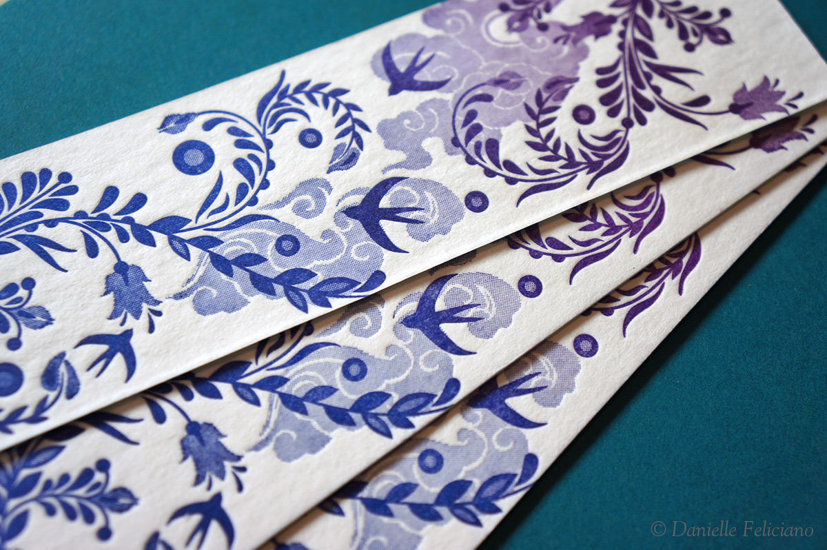
Above you can see the result – I made a few bookmarks using some designs from a previous attempt at halftones. In the above photo you can tell that the violet ink was too thick (afterwards adjusted) and that there is some filling in an blotchiness in the prints I’m showing. These show a much better value range, however I found with the ombre the 100lpi was filling in more than I liked, and so I think I’ll stick around the 80lpi I have been using previously. I do not think I would have as many using using the 100lpi if I was printing in a solid color because the ink would be distributing across the rollers better, but I don’t think dropping to 80lpi creates any serious visual degradation to the image.

In this sample you can compare an earlier halftone attempt using the same digital file (for the leaves anyway – I added in some 10% tint clouds) but two different plate makers. In this case the new plates show a much better value range – something I can only explain by assuming that Concord Engraving adjusts the files differently when putting them through their RIP software. Both plates printed well, but the halftones in the Boxcar plate are too dense and dark. I wouldn’t really blame Boxcar here because they make fabulous plates, but I’m not sure what to tell them to do to get the results I get from Concord. So, there you go – halftone ombre.
Final Prints: