Working with halftones is not the easiest thing with letterpress. It doesn’t quite work like screen printing and four color process is not necessarily something recommended for this sort of printing. This is just the beginning stage of a longer experiment with what works, and what doesn’t with halftones.
Watercolor Wedding: Success
You may have noticed a previous post where I did a wedding invite with a watercolor halftone background. In this case, the halftone was a success. The soft feathery image gave some wiggle room if the ink didn’t lay down perfectly and it was all meant to look like one color. For this job I began with a black and white bitmap image and sent it straight to Boxcar Press with instructions to have it made into a 100 LPI halftone plate.


Two Tone Invite: Ehh…
Success with the previous project prompted me to try something a little more challenging – a two tone graphic invite. I wanted to be able to print a one color invite, but get the feeling of a two color invite by using one solid color and a screen to make a tint. This did not work out as well as I had hoped. Ultimately, I should have just printed it in two colors, but you can’t blame me for trying. I did the invites for a friend and was given free reign to do as I pleased, she was still really happy with them, but I rated the experiment a ‘fail’ simply because the two-tone effect was not achieved satisfactorily.

Above you can see the file. There was a lot more contrast between the lighter tone and the darker tone. I set the tint to 30% which looked good digitally and had boxcar make a 100LPI plate. Still, when I went to print it came out much darker. I added a nice plum edge painting to add some pizazz and make up for the lack luster two tone effect.


Two Tone Holiday Cards: Failure
I was determined to try for a two tone effect again, this time I was going to create a much greater contrast between the solid and the screen area. I dropped it down to about 15%, but I had the same issue – the contrast when it was printed was not enough. The effect is there…. but barely. In either case, when you have a large screen like in the images below, it’s difficult to get solid ink coverage, it ends up with a slightly mottled effect. I didn’t really mind it and knew it would be a part of the final design, but I’m unhappy with the contrast between the solid and the screen. I’m wondering if it’s the density of the LPI I’m asking for. Perhaps if I space the dots farther with say a 50LPI screen the effect will be better. I can’t seem to figure out the secret, but I’m planning to try again.


Conclusion # 1:
Halftones weren’t really designed for letterpress (I basically confirmed what I was already told hah!). I will probably try and update this post with a third attempt – this time to create a third color by overlapping two colors. I’ve seen it done, and it’s quite beautiful, but I’ll have to try and figure it out on my own. There are clearly some limitations to this technique. I may also try a two tone image again but with a more open screen and see if that makes a difference. Honestly, these weren’t difficult to print and I had no issues with filling in the screen areas, so if I can find the sweet spot, it could be a neat thing to add into the repertoire. If anyone else has had halftone success let me know what you did!
Update…
So I couldn’t accept that as that, and I have a second set of experiments. I talked to the lovely people at Concord Engraving – the new place I am ordering plates from – and they made me up a test plate. The gent over there, Max suggested I try a differently shaped dot… a Euclidian dot to be precise. Check this link. Also, see below.
![]()
![]()
On the left is a round dot, and on the right is a euclidian dot. Apparently, differently shaped dots have different press advantages and disadvantages.
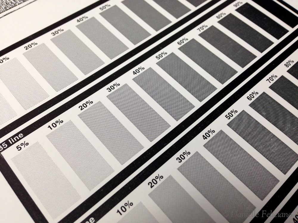
This was the proof of the test plate they sent me –

You can see that each bar has a different LPI. This proof was printed on a Vandercook.
Well, it looked great, but I had to test it on a few different papers.


I ended up cutting down the plate a bit. First thing I noticed (remembered) is that halftone plates need SO much ink. I had to keep adding ink, and even then I think my proofs, being on cottony papers, were still a little off on the ink


You can see that on the low end of the scale, they look very even, but it was on the dark low end that I started to lose a lot of ink coverage. This is probably most due to the cottony paper types, as the slicker coated stocks worked better. I used Crane Colors (orange), Crane Lettra, Wild!, and some cheap brown bag paper form Michael’s. I liked the inking on the Wild! (middle above the brown bag) best, but I think that was from the heavy impression caused by not changing the packing.
Let us compare the plates above to the proofs from my previous plates with regular round dots.

This watercolor blotch actually turned out pretty good. I didn’t have too much trouble. This was sent as a bitmap image to Boxcar with instructions to do a 100 LPI screen.

This proof is where the problems appear. I don’t mind the uneven pattern, simply the lack of contrast. I learned that this darkening is called dot gain which is caused when the dots in the halftone grow. Check out this video. These two tone images above are at 15% and 100% and yet, look much more like 80% and 100%. The new plates with the euclidian dots show a better range at the high (tint) end even up at 133 LPI.
Conclusion #2:
The conclusion is still in progress. I have plans to try the two tone with the new dot shape on an upcoming wedding invite, we shall yet see… But do check out the following links for some more details on halftone letterpress –
http://dolcepress.com/blog/corporate/halftone-business-card
http://www.urbancottageindustries.com/blog/half-tone/
http://www.beastpieces.com/tag/halftone/
http://blog.parklifepress.com/post/2013/5/22/letterpress-and-halftone-screens
This post is SO helpful! Can you tell me how you prepared your bitmap? I’m assuming your watercolor image was originally a jpeg or png.
Bitmaps are done in Photoshop. All you do is go to Image>Mode>Grayscale (make sure to have adjusted the levels and get it looking good in grayscale before proceeding) and then Image>Mode>Bitmap. You have to play with the settings until it works out the way you want. Undo if the bitmap isn’t what you want and then reapply the new mode. I’m not an expert on doing it, I’m sure there are some youtube tutorials about it.