Want a little insight into the design process? Well this post is what you’re looking for.
When I start design for a client I always start with the typography. Typography is much less flexible than images. You can’t squash someone’s name to fit, but you can just draw something different to occupy the space. This when I put together sketches I go right into the computer, set the type and do quick sketches around it. I move organically between changing the text and drawing images to get the right look.
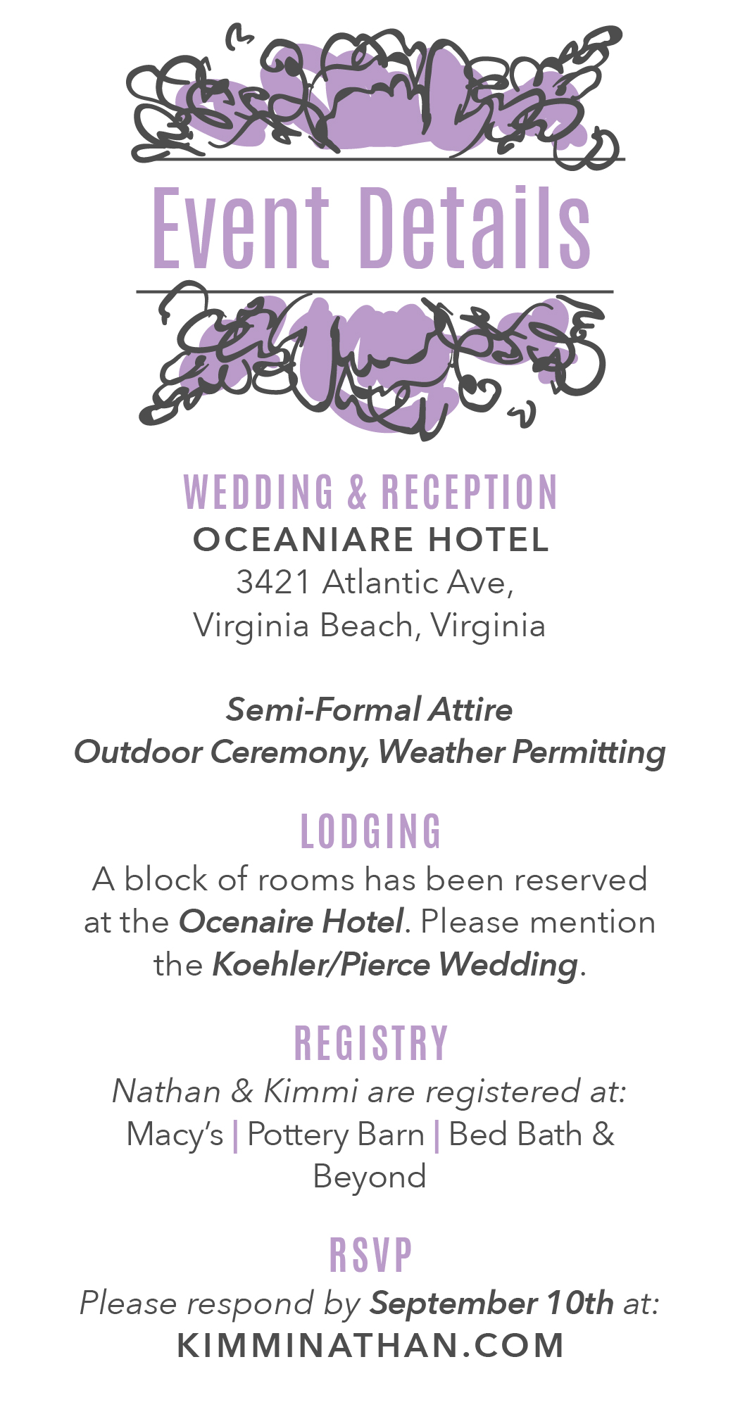
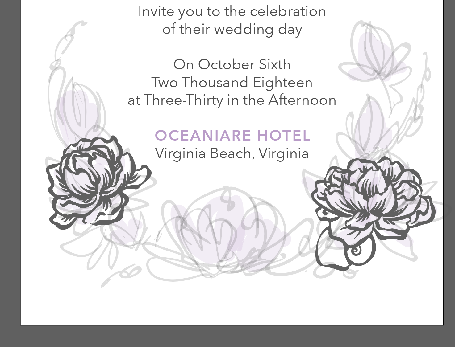
Here are some of the sketches:
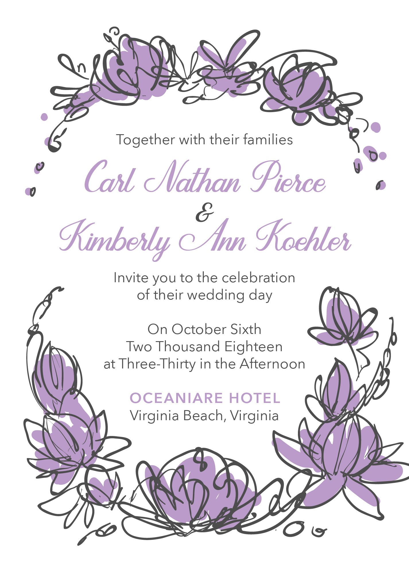
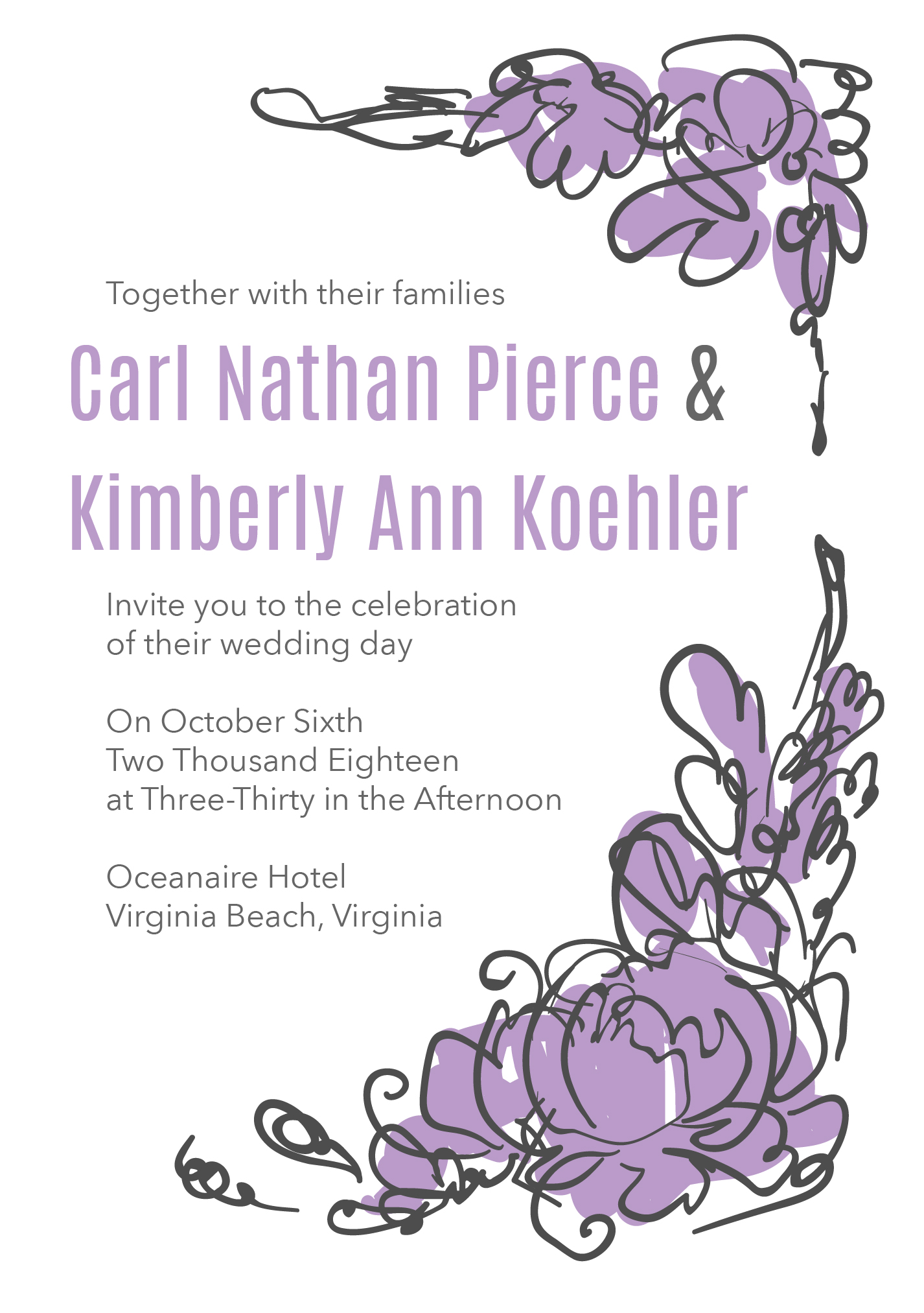

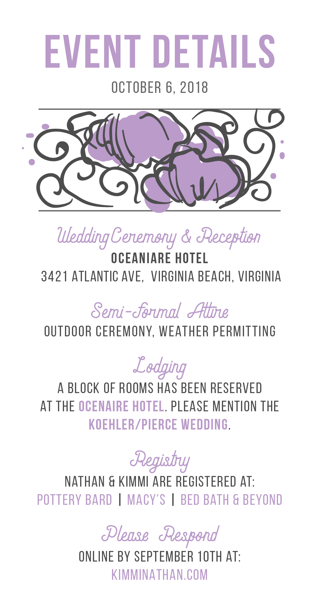
I think the “live” text gives a stronger impression of what the final designs will look like. One I’ve sent these to the client, they can choose which direction they want to go. I incorporate any changes they want and then begin the illustration.
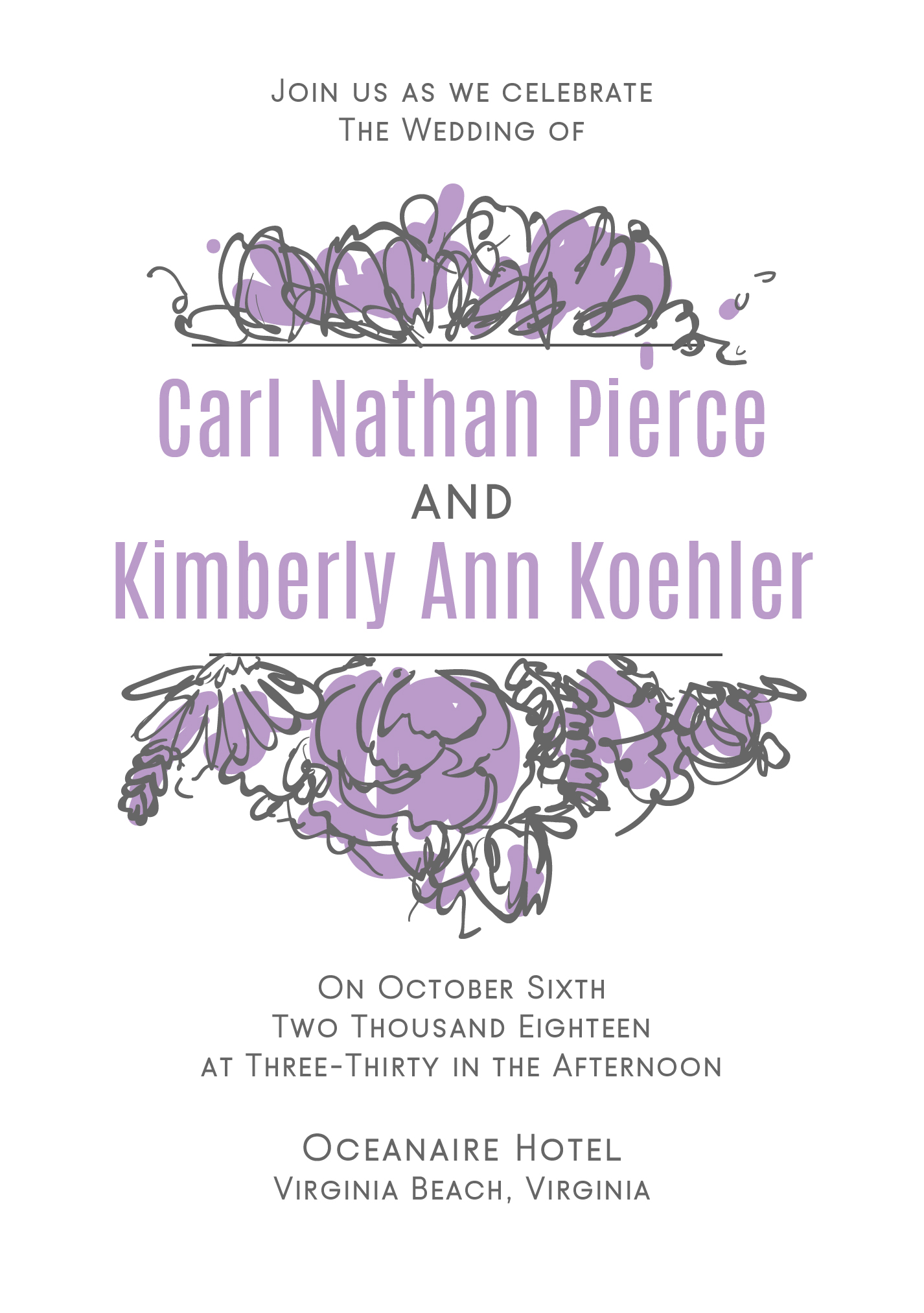
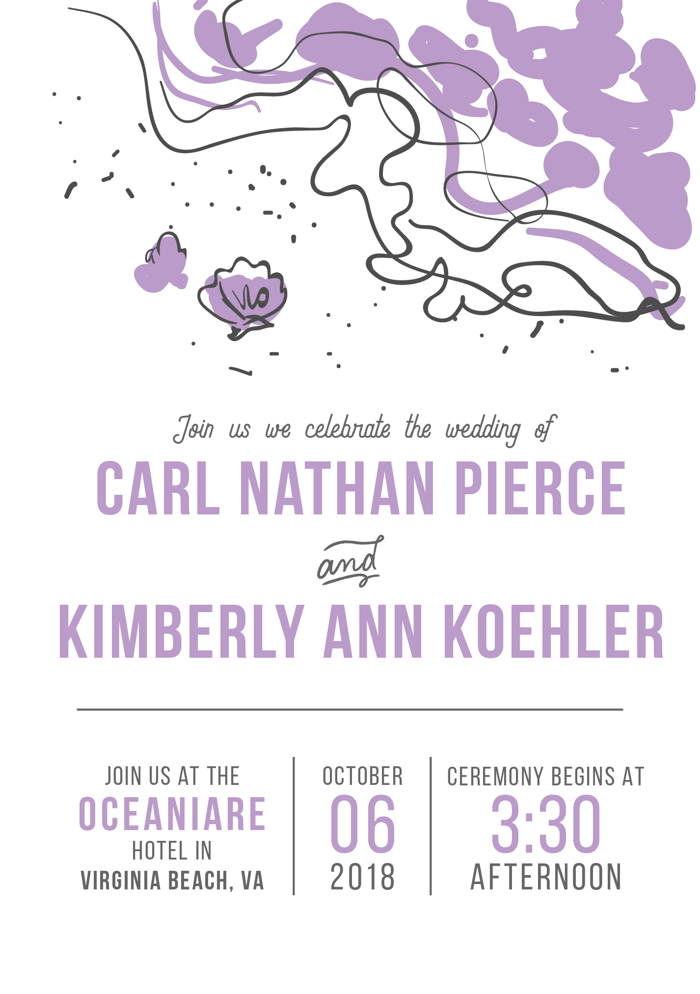
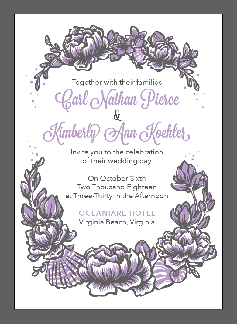
Once the Illustration is complete, I begin finessing the typography. We can try different typefaces at this time, edit the grammar/spelling, and add or change certain details. In this example we tried a few different cursive typefaces for the names.

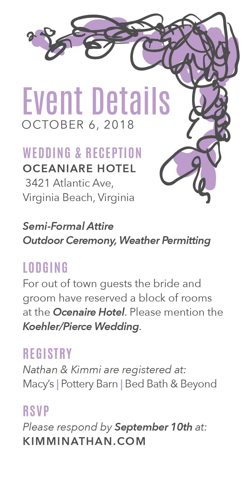
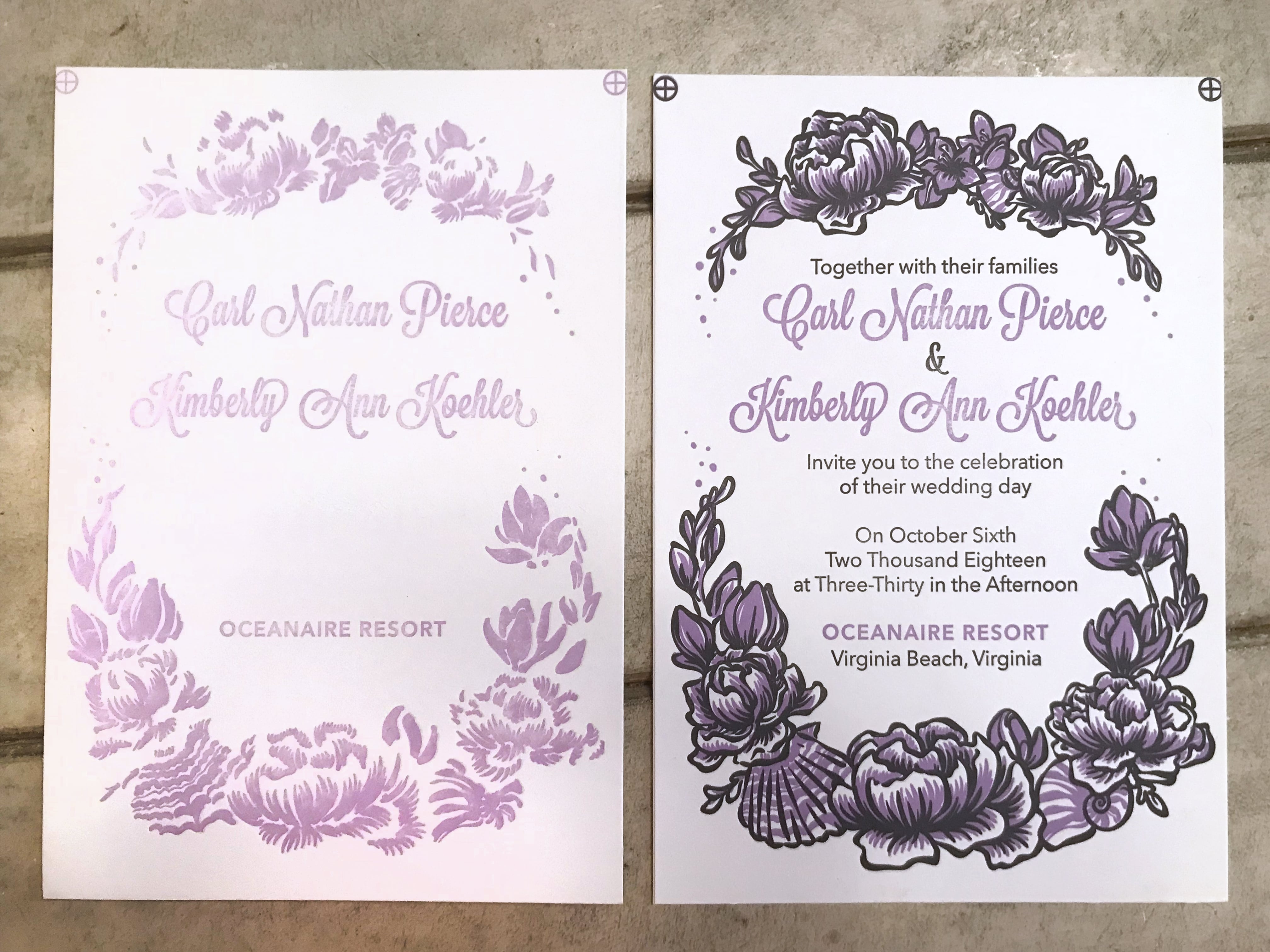
Once the final text has been chosen I send to the client for final review:
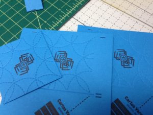
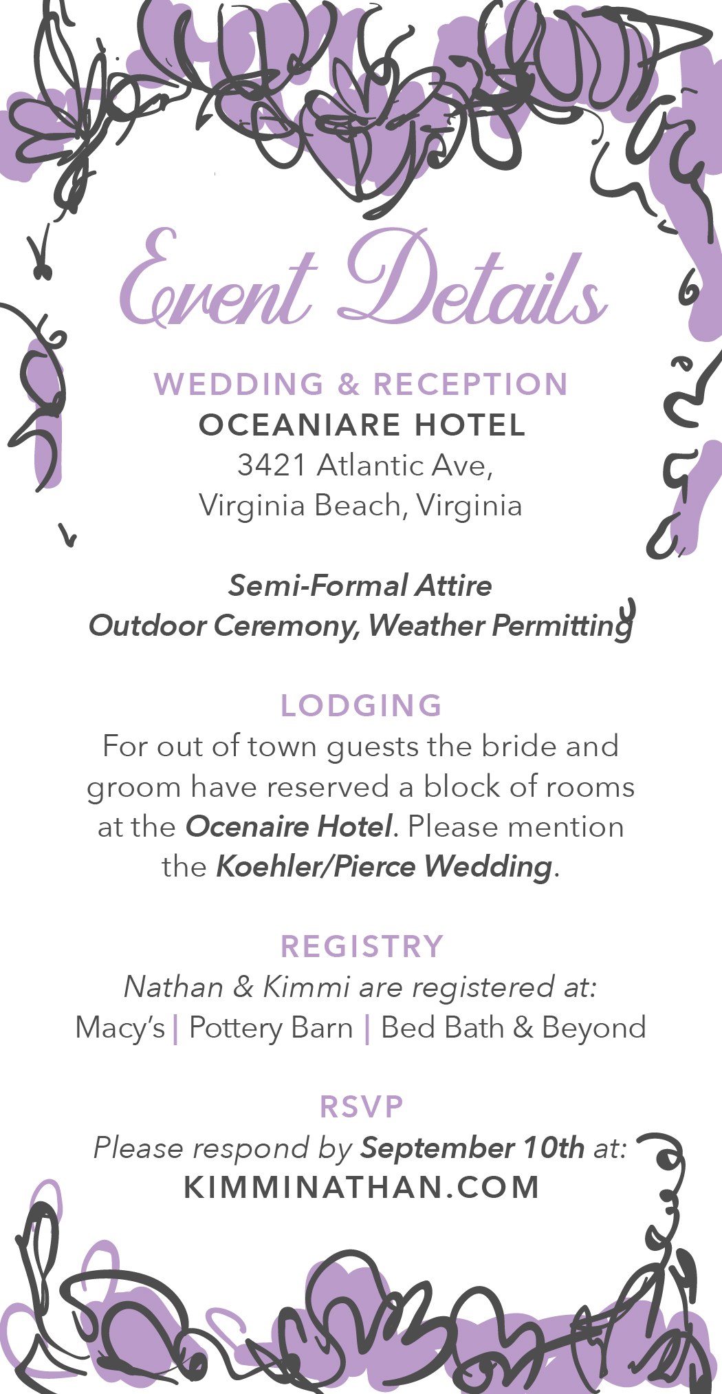
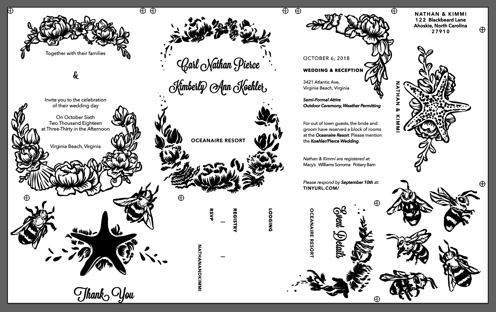
Then to platemaking. I separate each color, set text to outlines, and add registration marks designed to hit the top corners of the sheet. In this way I am able to line up both the image on the card and the image with itself:
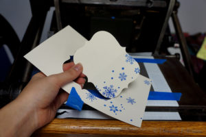
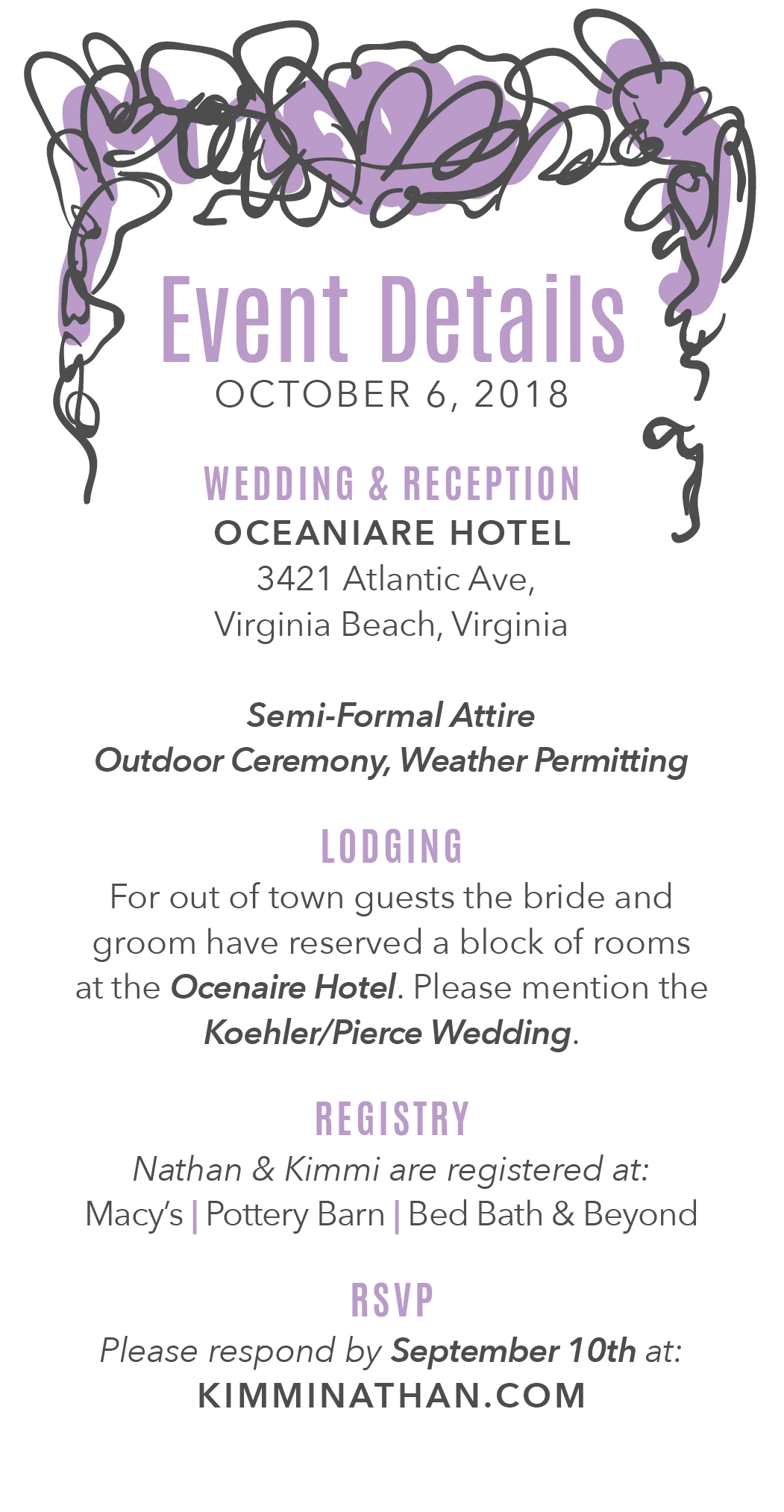
Then to the press – ink mixing and lining everything up. I have other posts that show that in more detail so this is an abbreviated look:


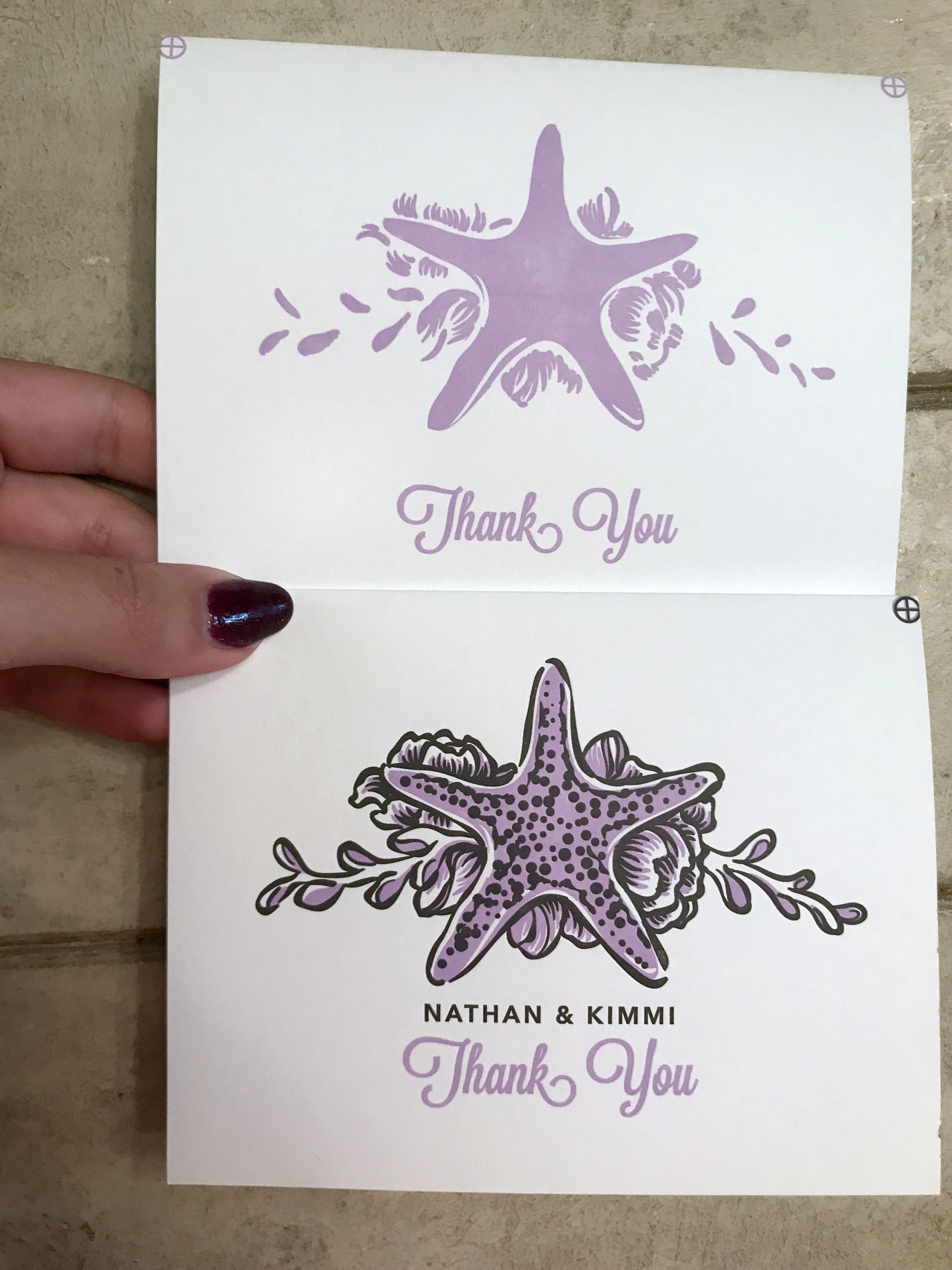
You can see how I use the registration marks to make sure the image is correctly aligned and placed on the page. Once everything is lined up I cut the crop marks off the plate.
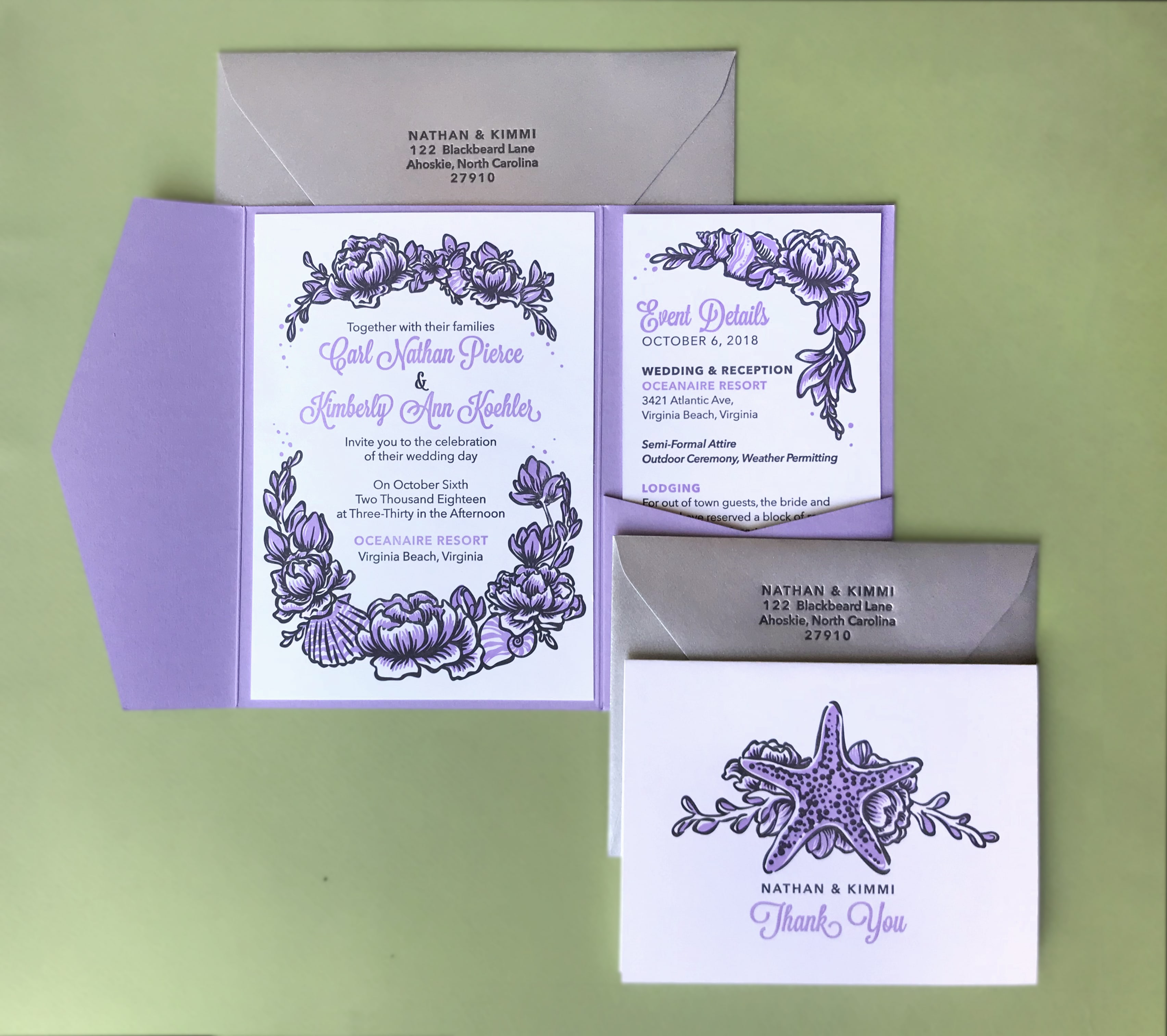
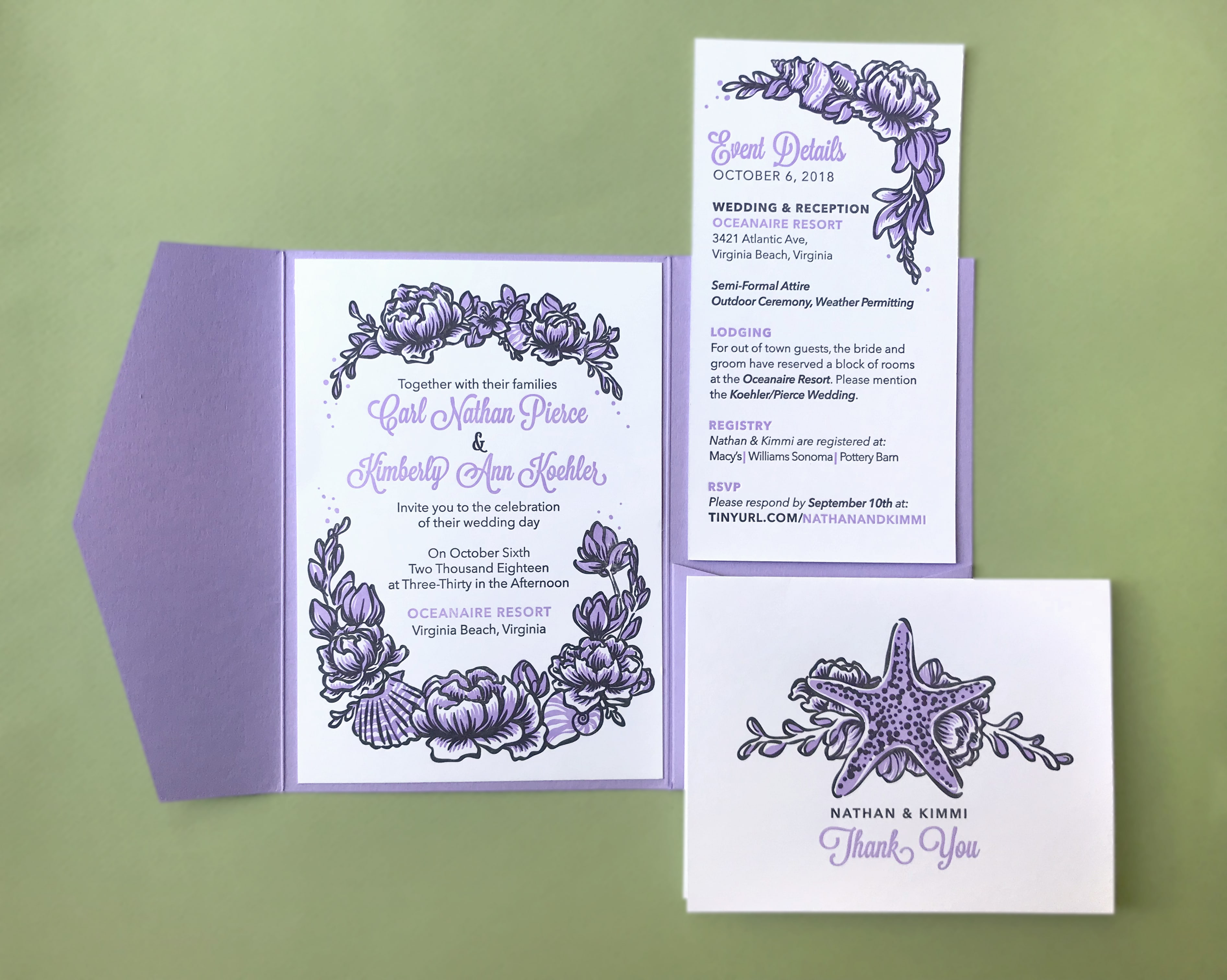
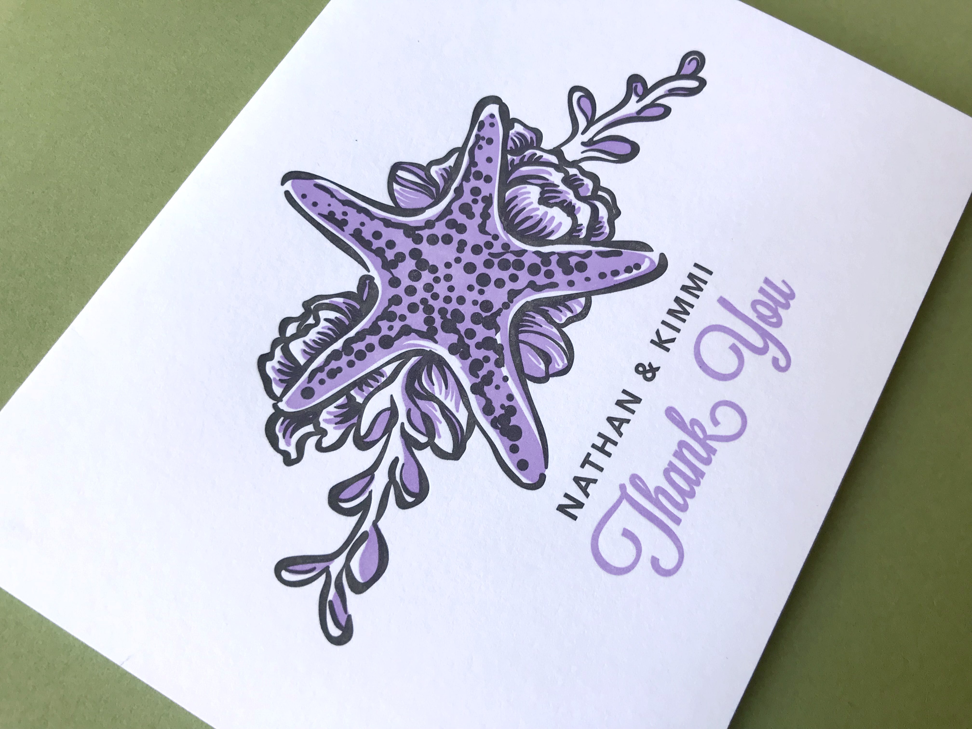
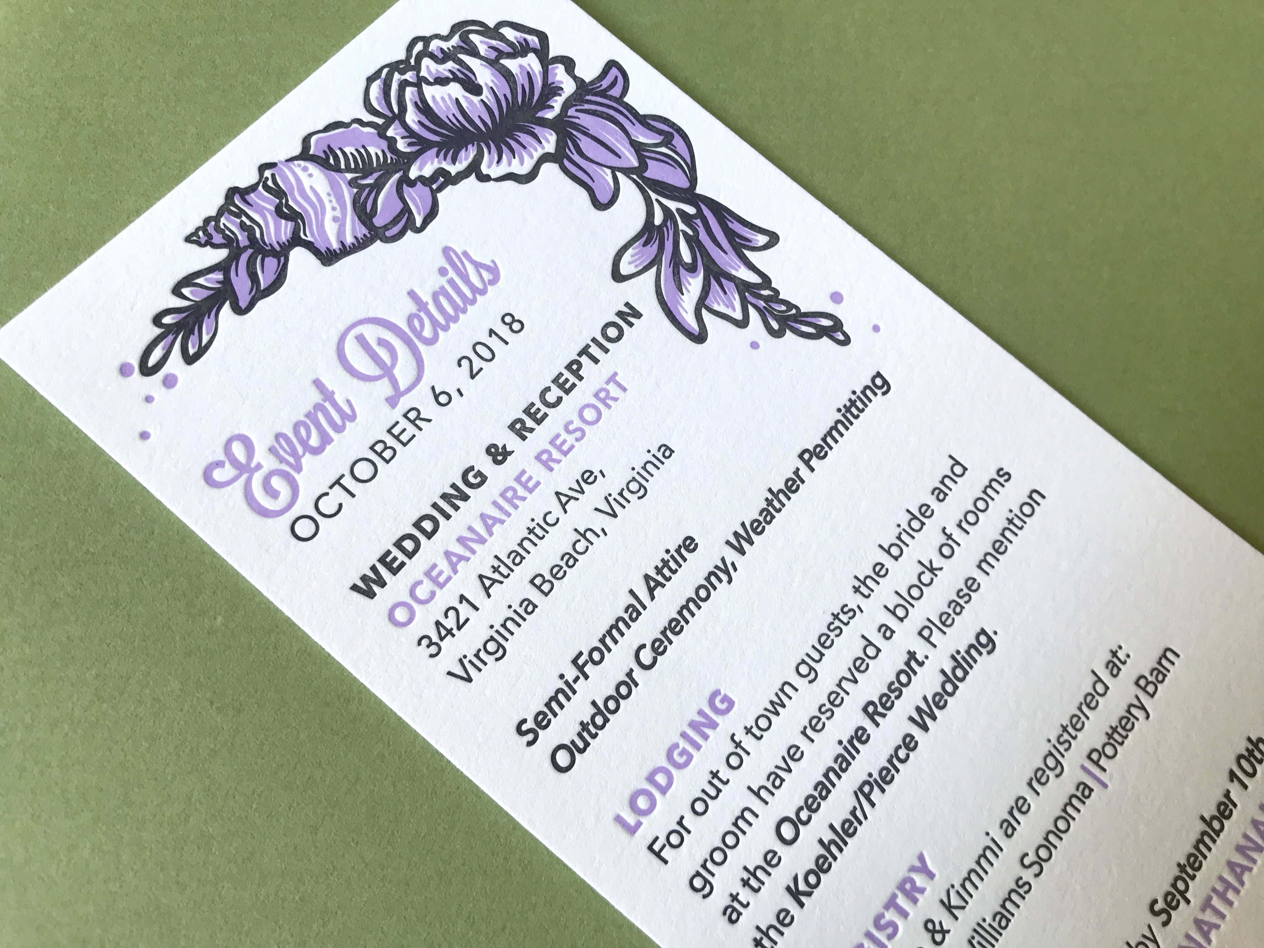
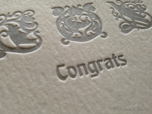
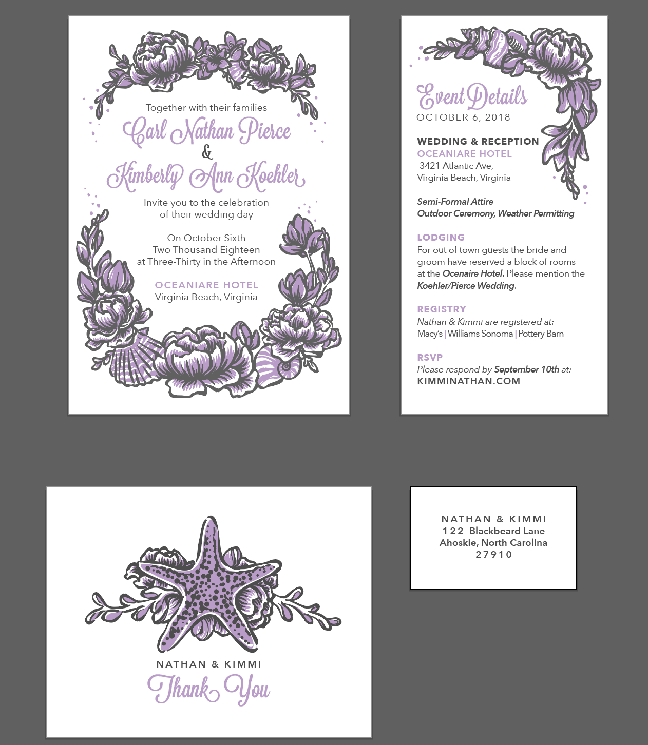
Finally, I print and assemble the suite!