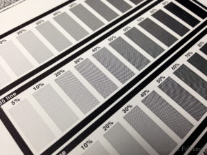
So in an effort to test a few new effects, I have done a new halftone project. These plates were made by Concord Engraving – a platemaker that I’ve started working with with year and am very happy with (they produced the halftone test plates previously for me).
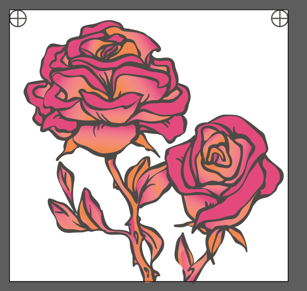
For this project I wanted to try and blend two colors together. Here is a screenshot of the artwork done in pantone spot colors:
And below is the process – I line up tight registration using (what else) registration marks. I find lining up too frustrating without them when I’m doing more than two colors because sometimes I’m not entirely sure what they need to look like when the first two colors under the lineart are in alignment (essentially, without the black linework I don’t even KNOW if I’m properly lined up sometimes because I can’t compare exactly how the two under colors need to look together).
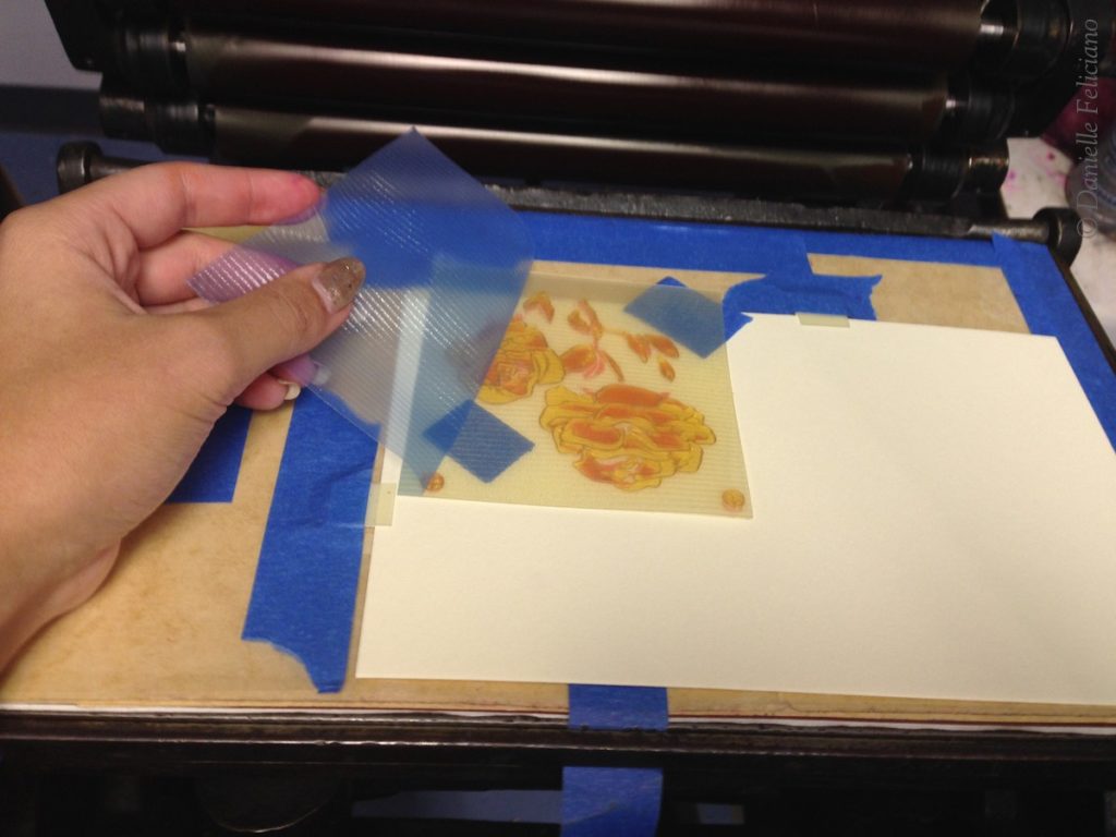
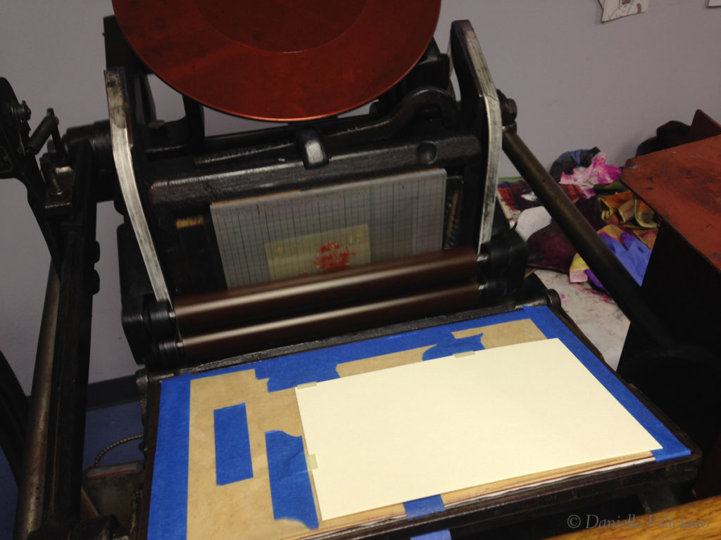
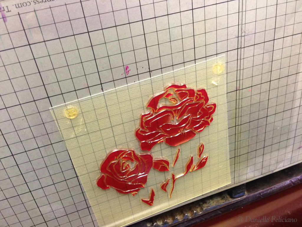
So this is how I line up my plates – essentially, I make marks on the paper and on the plate using a ball point pen (seems to work better on the plastic than sharpie) and get the first plate into alignment. I put tape in the negative areas of the plate and stick it down. Then I set/adjust the gauge pins to fit the sheet so that the plate will be as centered on the press as possible and this get the most even impression. Then, remove the plastic backing, set the press to print, and roll it by hand until it deposits on the base. Back it up slowly to pull the tape out of the way, and bam, ready to print.
Then I printed the first color – this was my biggest regret with this project – why wasn’t I smart enough to print this part in yellow instead of orange?! The color blending would have been so much better…
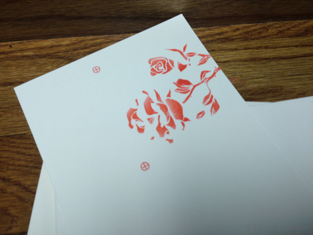
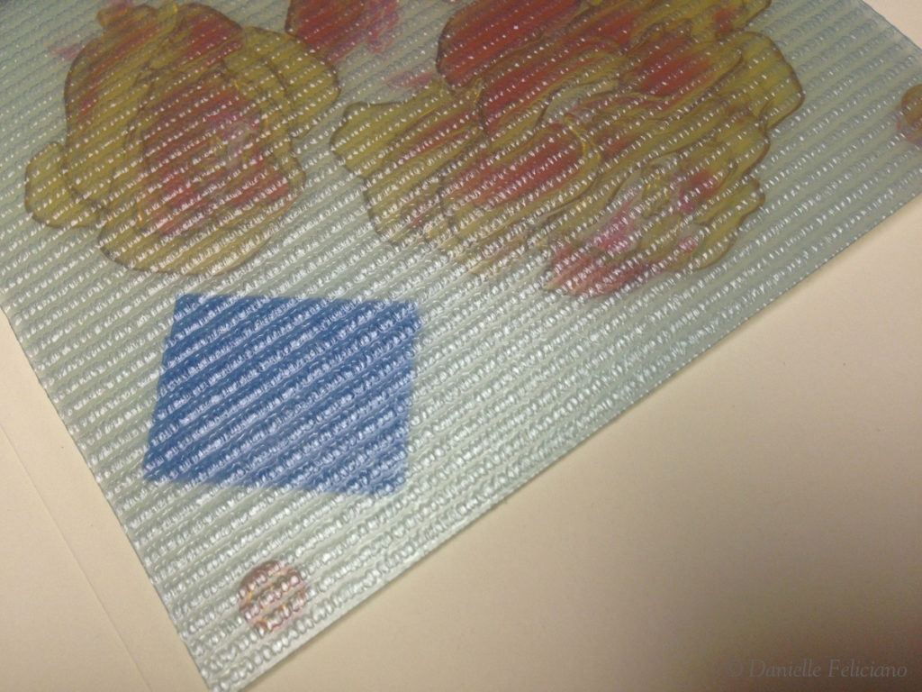
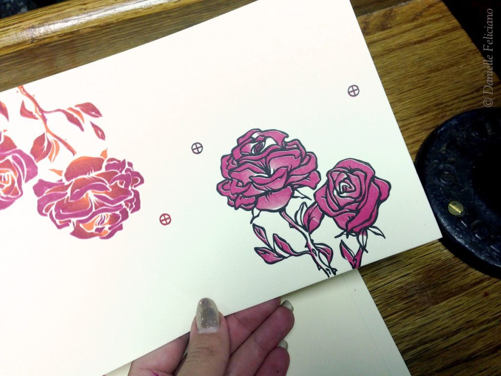
Once I’ve taken a few good impressions on the actual paper I shave off the registration marks with an exacto knife. Be sure to try and cut AWAY from the image on the plate and AWAY from the rollers, should you slip. I often don’t even remove the chase, I just very slowly cut them away. Below you can see the pink plate with the removed registration marks.
Then, onto the next color. To do this I take one of those first few sheets with the registration marks, and seat the second plates registration marks into the first ones. I deposit that plate onto the base the same way, and then adjust the pins if needed to shore up the line up. Often I’m moving the pins hair widths – just the littlest bit at a time. If I see I’m misaligned, I will place the misaligned piece into the pins and hold it down, then I will look at the direction and amount it is off and will keeping the page in place – scoot the pin one way or the other. This is all done by eye, but by placing the piece into the pins I can directly compare the misalignment distance with the adjustment of the pin.
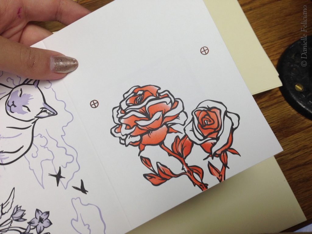
And then the next color gets printed. I once again take a couple impressions with the registration marks and then shave them away and keep printing
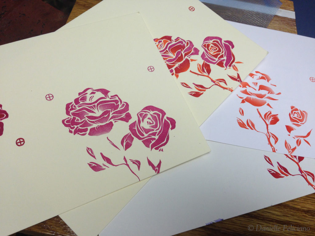
Finally, the last color is lined up the same way. You can see I did a few prints with just one color of each of the colors (pink and orange), so I could be positive of the line up with the registration marks
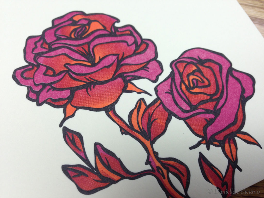
And at last, a lovely bit of tone blending. Because this was just an experiment I used colors right out of the can (Tiger Lily and Rhodamine Red) Why I didn’t use yellow to get a beautiful color blend with good contrast… no idea.
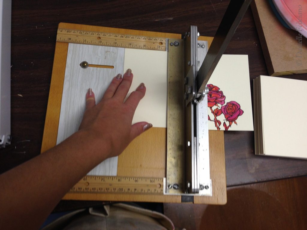
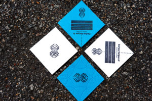
Then some manual scoring on my weird Thrift Store find scoring device, and the cards are done!
Here are a few more detailed pictures:
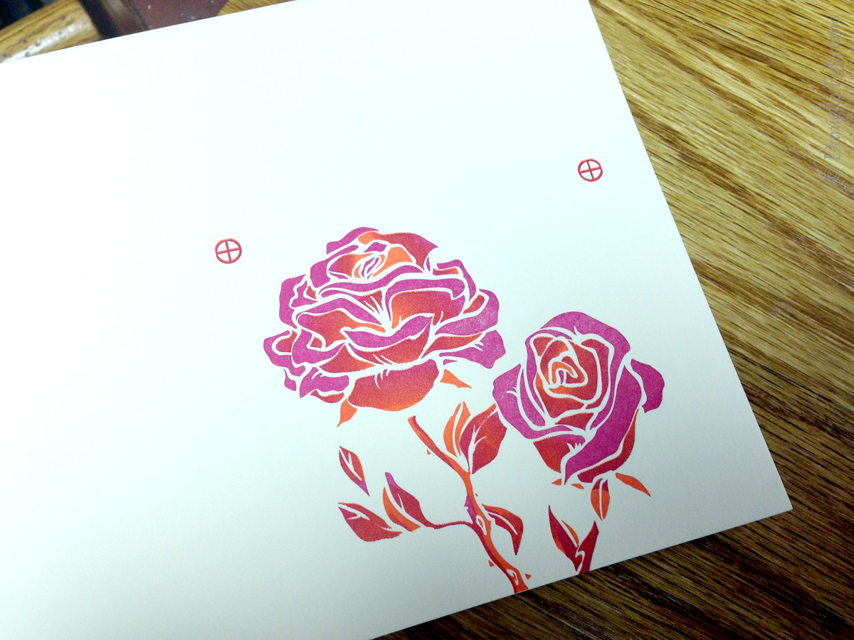

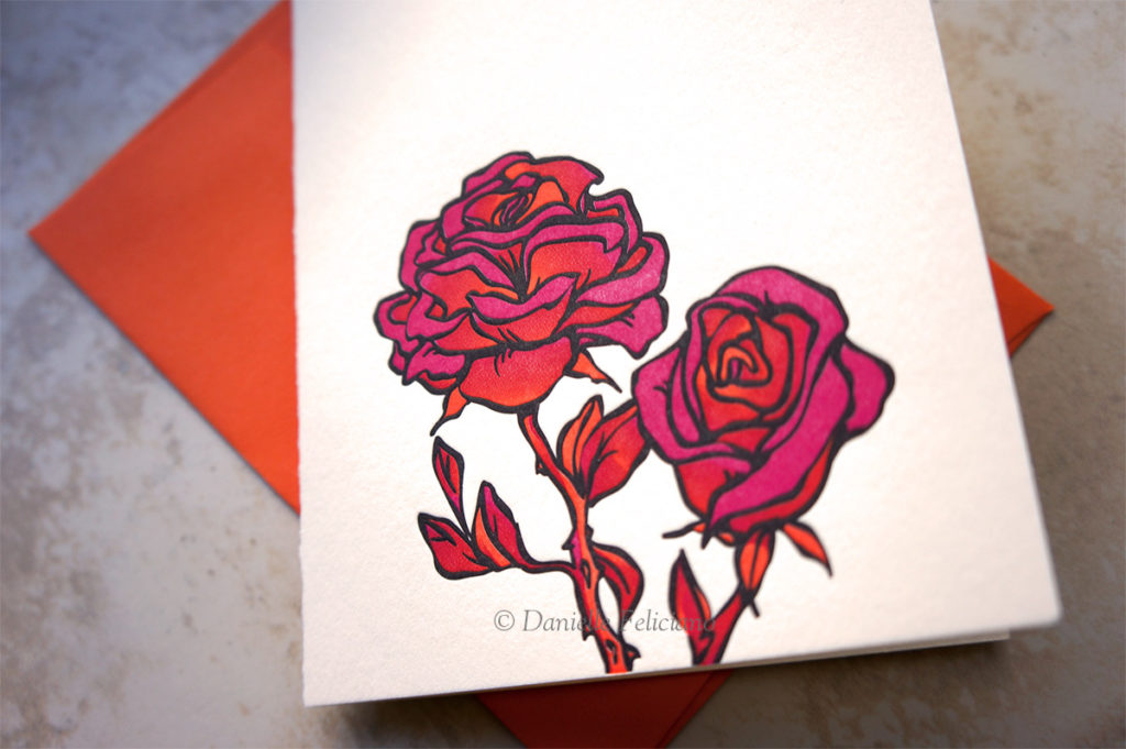
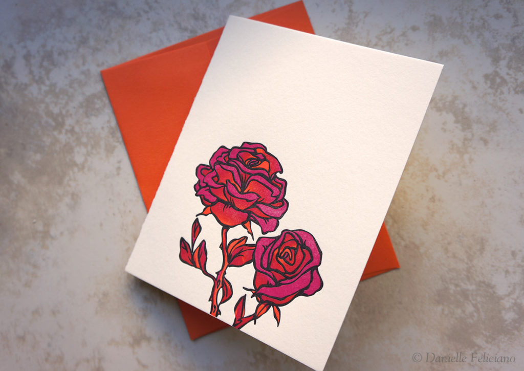
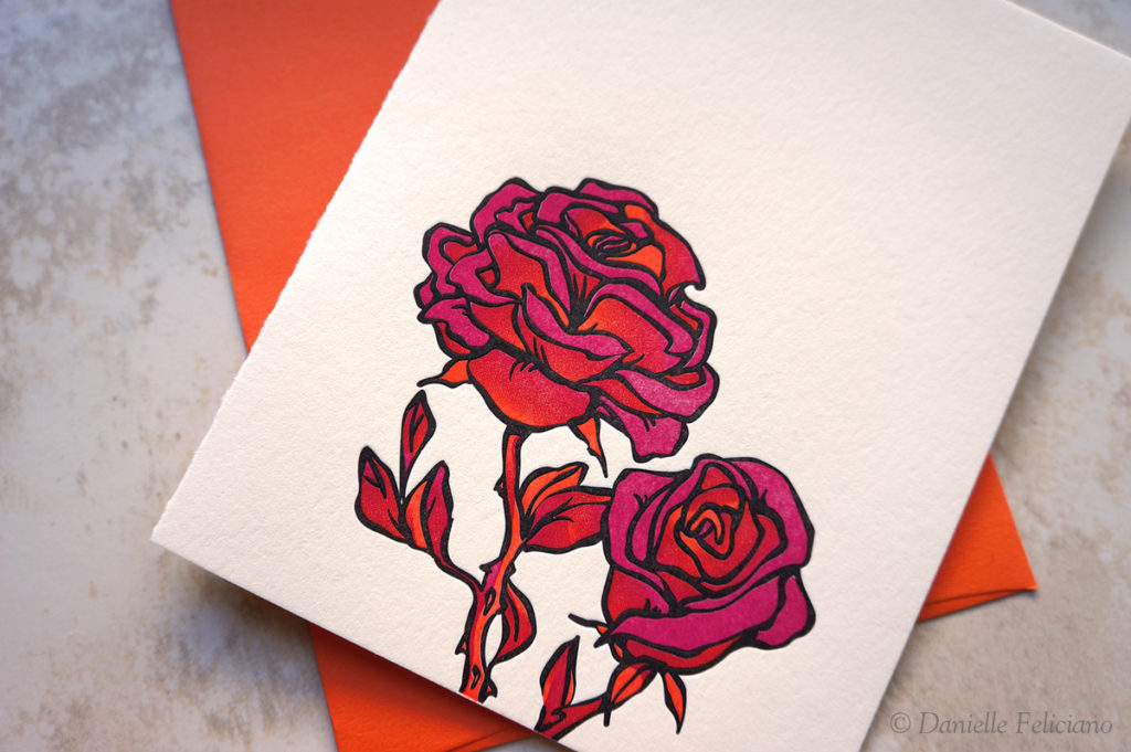
That turned out very nicely.
Wow. These are amazing. Great experimenting with halftones. Do you make your halftones in Photoshop or in Illustrator? Or is that something you let Concord Engraving do from a gradient you produce? I’ve got some ideas for working with halftones both with letterpress printing and with my Risograph, but I wasn’t sure what the best route to travel on with creating halftones would be. I’m comfortable in both Illustrator and Photoshop, but tend to do most of my letterpress work in Illustrator. Any tips?
I did not do the halftones in Illustrator. They are done by the printer using RIP software (which is exorbitantly expensive). All I need to do is specify the line screen (100lpi or 80 etc). As long as I use pantone/spot colors (or keep the colors separate) it works fine. Illustrator, weirdly enough, is not very good at making halftones. There is a filter where you can make a gradient a halftone, but it is not very good and cannot be used with a bitmap image or two color work. Halftone images can also be made in Photoshop by converting the color profile to a bitmap (but the image needs to already be one color it won’t separate them out). Honestly, it’s best to let the printer do it for you when they make the plate – nearly any printshop out there will have the RIP software and can do it for you.
Ah. This makes so much more sense than trying to do it myself! I have been using Concord Engraving for making my plates lately and love them. Do you send them the color artwork with the gradients in layers (like the original above) and they create the rest? This would most likely save my sanity … haha. All your halftone experiments are so inspiring! 🙂
Yep I just send them the colored artwork if it has blends between colors. In all other cases I organize the plates myself.
It is great to see you trying different forms of letterpress printing. Research will help to avoid
problems. Halftones or screens should be printed with a softer packing than used when printing type matter. The smoother the paper the better the dots will reproduce. Short-bodied
ink will reproduce better printing on a platen press. Rollers tracks should be clean & powder
rosin applied to ensure proper roller rotation. C&P & other press makers added a third form
roller to overcome ink coverage problems. For a cleaner job with screens, reduce ink increase impression. Heidelberg produced a books in the 40,s & 50,s to help improve
print quality. One such book was done mid 50,s ( Hints for the pressman )